Alderwood Adventures: 2025 Atlanta Homes & Lifestyles Southeastern Designer Showhouse
- Victoria

- May 25, 2025
- 37 min read
Updated: May 28, 2025

So, what exactly is a showhouse?
Basically, exactly what it sounds like. Builders, exterior architects, interior designers, landscape architects, cabinetry designers, and specification designers all converge to create a masterclass of talent and showmanship all in one home that is specifically designed to WOW. Each designer brings their A-game and at the end of the showcase the home is open to be purchased, with or without the fine furnishings and decor. (Usually, anyone that wants to, can buy the decor and or furniture in the home during the showhouse, but if you do purchase anything, you cannot pick them up until after the showhouse is closed.)
The showhouse also pours back into the surrounding community by selecting a charity as their beneficiary. This year it was Hope Heals, a nonprofit dedicated to creating sacred spaces of belonging for those affected by disabilities and spaces which focus on an accessibility-first approach. Visit hopeheals.com for more information and to see the inspiring work they do for their community!
In short, the showhouse is a fantastic way for design professionals to market their incredible talent, for the general public to come together and appreciate the art of a luxury designer home, and for the opportunity to purchase incredible finds sourced by designers all while giving back to the community!

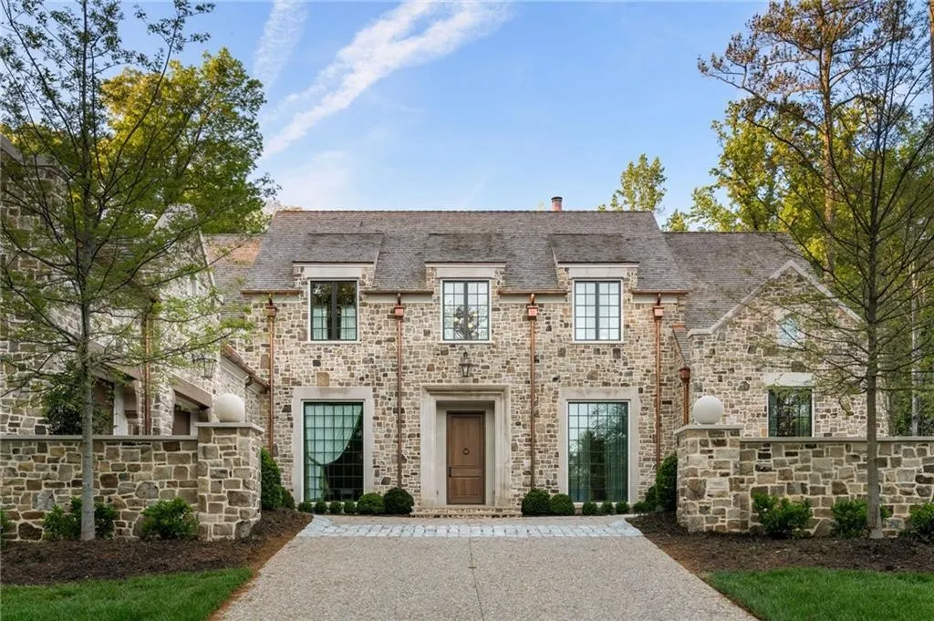
Originally a classic Buckhead home, the 2025 showhouse was the brainchild of Cole Construction, exterior architectural designer William T. Baker, interior specification and architectural designers SOURCE, and the landscape architectectural designer Land Plus Associates. This conglomeration of companies came together to design and build an expansive $15 million, 10,000 square foot, 7 bed, 9 bath, 21st century adaptation of the traditional stone cottages of the Cotswolds. Taking inspiration from English manor homes, the showhouse boasts hand-carved limestone surrounds on all of the windows and the main entryway door, a cedar shake roof, and an eye-catching copper gutter system which all effortlessly meld together to create a stunning blend of modern and classical character.
Thanks to SOURCE, all of the interior architecture and the specifications throughout the home coalesce and create flow from room to room. This is imperative to the home as a whole picture, because each interior designer at the showcase is assigned their own room and they work independently without consulting one another!

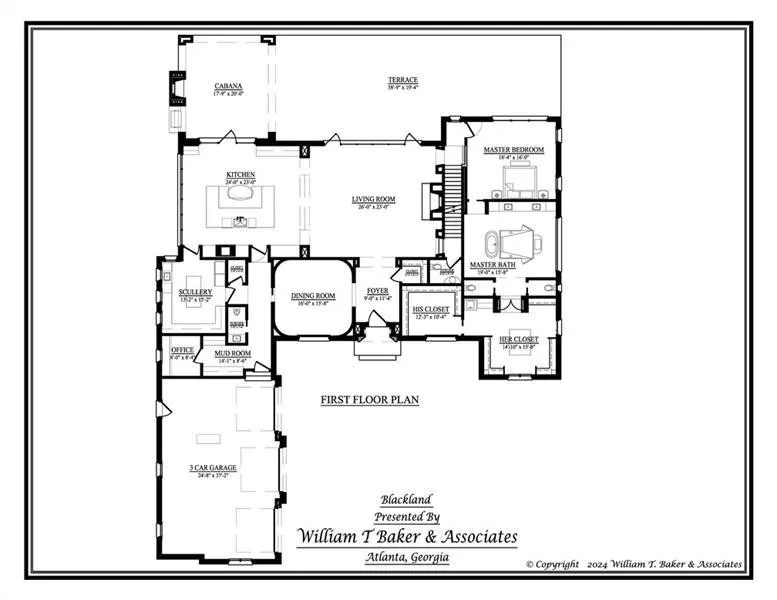
The First Floor:
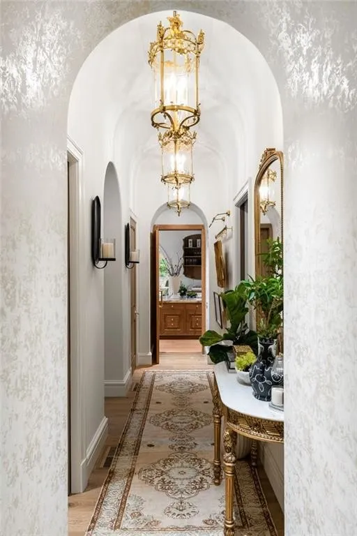
To begin our room by room dissertation, we are starting with the main entry. The foyer, created by Nashville designer Evan Millárd, is a great example that fully embodies the aformentioned blend of styles from the very first step you take into the home. Filled with character, and boasting beautiful wood floors inlaid with a marble surround helps to bring in visual interest and contrast while continuing the trend of blending traditional flooring with modern and contemporary accents.
The wainscoting on the walls and Vinetian plaster on the ceiling bring texture, warmth, and help to disperse light throughout the space, while botanically inspired art work and lighting create a warm welcome to all who enter. Our favorite decorative aspect of this entryway had to be the delicate porcelain florals set in shadow boxes and seemingly floating in mid air thanks to their custom easel stands.
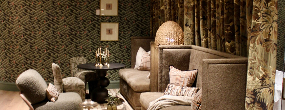
Moving into the livingroom, we were floored. Honey Collins Interiors absolutely knocked it out of the park! We were completely surrounded by Venetian plaster. Incase you are not aware, at first glance, Venetian plaster appears to be a smooth, polished stone. This is due to the special techniques and coatings applied during install. Imagine walking into a room that appears to be completely carved out of the smoothest stone you have ever seen, that is what it was like through most of the showhouse! The walls, ceilings, and the enormous fireplace (Victoria is 6'2" and her head only barely hit above the top of the inset of the fireplace!) all appeared to be stone but were in fact plaster! This really amplified the space and allowed for light to bounce around and bring in visual movement from the back wall that was nothing but beautifully draped, floor to ceiling, moving glass walls. While we were there, the glass walls were fully opened and artistically framed an incredible view of the entire immaculately manicured backyard.

The livingroom was expansive, and we loved how Honey Collins Interiors utilized the furniture to divide the space into intentional and purposeful "zones". This is a trick designers often use to maximize the function of larger spaces. Just because it is a common tactic, does not mean that it does not take an immense talent to correctly implement into a space, but Honey Collins really made a masterclass out of the living room!

One zone was dedicated for small conversation by the fire, the second zone was dedicated for entertaining a large gathering of friends and family, and the third zone (not pictured) utilized a massive console table which acted as a physical divider between the entertaining space and as border to the pathway in front of the moving glass walls. Honey Collins designed this space to feel like a "quiet conversation between old and new". Her keen eye tastefully mixed traditional furnishings, on trend, yet still classic burlwood statement pieces, modern floor and reading lamps, marble obelisks, and plush oversized upholstered furniture from her own line. We also really appreciate when a designer incorporates several plants or floral arrangements into a space. A room is never really finished without the touch of life that plants bring to a space! Honey Collins really delivered with statement florals and greenery throughout the room. It is clear this space was designed intentionally and with love and appreciation for both the past and the present.

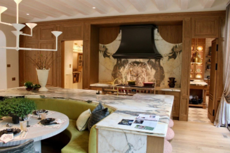
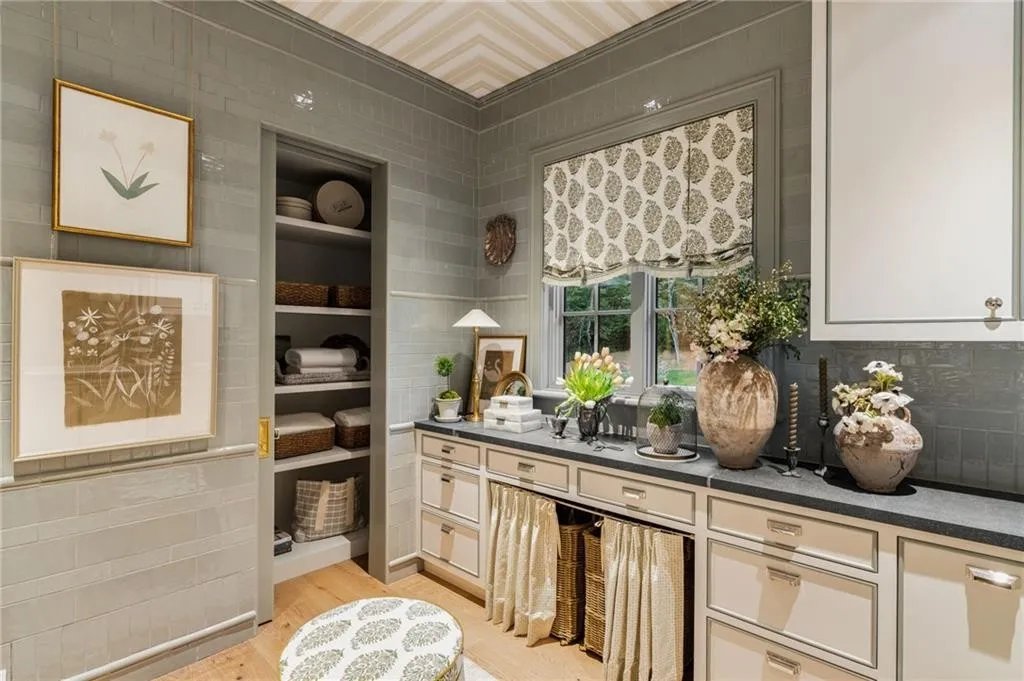
Turning left into the kitchen, we stopped dead in our tracks and our jaws might as well have been on the floor. The Venetian plaster again continued from the living room and into the kitchen to form an incredible cantilevered statement ceiling that was an absolute work of art. The cabinetry created by Kingdom Woodworks took immense attention to detail to create the seamless inset cabinetry, panel front luxury appliances, and the island that measured at least 15 feet long x 15 feet wide. We loved how the island commanded attention with a bold and colorful countertop. Our eyes were kept moving from one aspect to another throughout the kitchen and we never noticed a flaw, it was beyond impeccable!

The kitchen included an array of luxury amenities, the short list of which consisted of the following features. A coffee bar that included a small wine cooler, inset cabinetry, an integrated stone bar sink, panel front refrigerator drawers, unlacquered brass faucets and hardware. A massive built in dining nook island, complete with a casual barstool seating area inset into the side of the island. A main cooking area that included a huge range, full size panel front refrigerator, and seamless stone to wood transitions above the range. All of which were opposite an enormous arched window with a hidden door that lead to a stunning outdoor seating area. Source and Kingdom Woodworks could not have done a better job.
In charge of completing the kitchen and scullery, Studio MC focused on mossy greens and shadowy neutrals to really balance the overtly warm space and create a bold yet layered classic feel to add traditional character to the modern leaning space. In styling the kitchen, Studio MC focused on creating a living workhorse that "would make even a quick weeknight dinner effortlessly elevated". Creating a curated yet livable space takes talent, something Studio MC has in abundance! There was absolutely no lack of function, storage or beauty. What we loved most about the kitchen is that it was well designed to anticipate the needs of the user, as all well designed spaces should be! What an incredible blessing it will be to the future owners of this home to have a house designed to work and function alonside their needs, insead of a house built for the masses that makes daily tasks much more difficult and is not efficiently planned out.

To the right of the range in the kitchen lies the absolutely breathtaking scullery. Depending on the area you are from, you may call it a butler's pantry, back kitchen, working kitchen, or a prep kitchen. Either way, having a scullery makes entertaining so much easier!

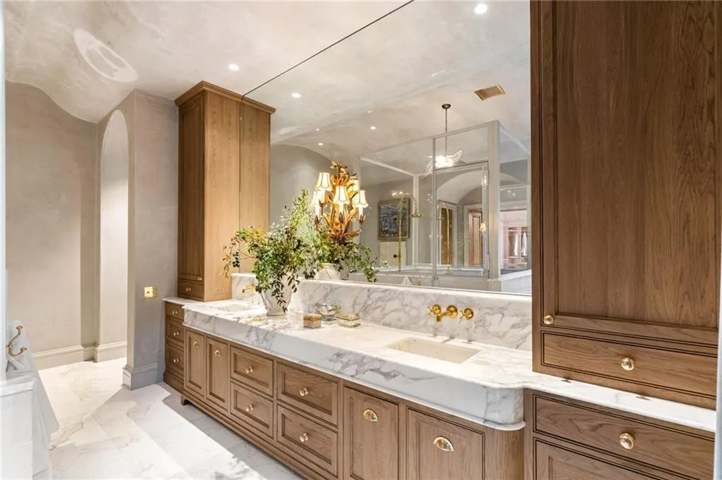
The scullery pulls double-duty acting both as extra storage and as a mini, fully- functioning kitchen. As such, the straight hewn white oak cabinetry with brass hardware, and the bold multi-colored veined stone countertop from the main kitchen is replicated in the scullery to create a cohesive feel from room to room.
Encased from floor to ceiling with an exaggerated, beveled, stone designed to look like hand chiseled bricks, harlequin two-toned marble flooring, brass pendant lighting, and floor to ceiling fully lit built-ins ensures that the scullery exemplifies elegant attention to detail and functionality.
We loved how the scullery mimicked the kitchen and that Studio MC mixed open and closed storage options in every aspect of the room. The island was split with open storage on one end and drawers on the other, the built in china cabinet included closed upper cabinets, closed lower drawers, and visually open glass display cabinetry all beautifully juxtaposed next to the open floating shelving. As we stated with the kitchen, we could not have found a flaw if we had tried!

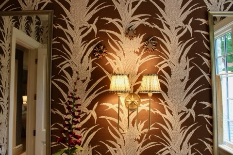
Moving from the rear swinging door of the scullery, we are brought into the back hall which connects multiple areas. Designed by Pamela Williams Interiors, the back hallway begins from the garage and extends to the left side of the range in the kitchen. The entry points to the back hall consist of dramatic arches carved out of Venetian plaster that is layered under hand painted wallpaper and are connected by a barreled arch ceiling. Designed to "make you pause and invites you to something beautiful even in the spaces in between", this hallway tastefully echos the architectural components of the hall in the decor pieces. While the hallway is artfully and purposely plain in texture, it is rich in decor. Antique statement pendant lights and a beautiful Louis 16th mirror replicate the shape of the entry arches while stunning portraits bring hardlined structure to the space.

Victoria was green with envy when she saw the suspended rail gallery wall as she herself is in the midst of implementing the same thing into her entryway hall in her own home. To see it completed and creatively styled in Atlanta made her immediately text her husband and apply a little pressure to their own project deadline! We really loved that Pamela Williams Interiors tied the two spaces she designed together through artwork color schemes, simultaneously balancing the fine details, and contrasting hard and soft visual lines. That takes incredible attention to detail and advanced planning both of which were clearly implemented!
Continuing down the hall, to the left is the most incredible "jewel box" powder bath we have ever seen. Many people try to attempt a jewel box but it often looks messy and too busy but Pamela Williams Interiors really showed off exactly how to maximize the wow factor in a small space! Striking apricot and ginger wallpaper shared the color theme of the artwork, yet still contrasted each other. Modern shelves mixed with antique frames and small decor items floated above the commode. The powder bath visually opposed the serene hallway, yet still complimented and paired the two spaces together perfectly.


At the end of the back hall lies a mudroom, just past the half bath, designed by Elizabeth Godwin Interiors. Once again, Kingdom Woodworks crafted floor to ceiling, inset built-ins which mimicked the apothecary style drawers on the kitchen and scullery islands. Designed to look like a multi-drawer cabinet, in reality the "drawers" are just a pattern on the doors that conceals lockers behind their façade. The mudroom also includes a convenient water bottle filling station (the first of two in the home) to the left immediately upon entry from the garage.
Bold wallpaper, custom crafted pottery, and hand woven baskets act as decor, proving that even rooms designed soley for storage and function can be areas that enrich your home as well. There truly is no space in any home that cannot be enhanced with decor!
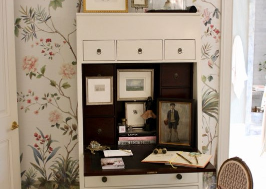
Moving past the mudroom hall, we enter a small but powerful office space, designed by The C'VION Company. Maximizing every single inch of this space, Calvin Watt of The C'VION Company utilized antiques, modern decor, artwork, lighting, a large mirror, abundance of textiles, and re-bound leather books to re-imagine what a multipurpose space could be. His goal was to create a joint library and office space without it feeling as structured as your typical library space. The office space is centered on a window overlooking the grounds, that really acts as a piece of art on its own which showcases the greenery of the exterior. Dancing around expectations and typical assumption, Calvin created a symphonic balance between new, old, expected, and inspired to create a completely unique space.


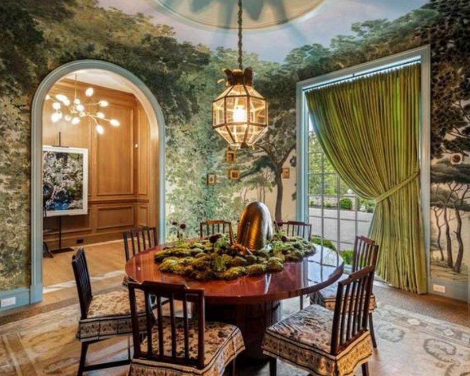
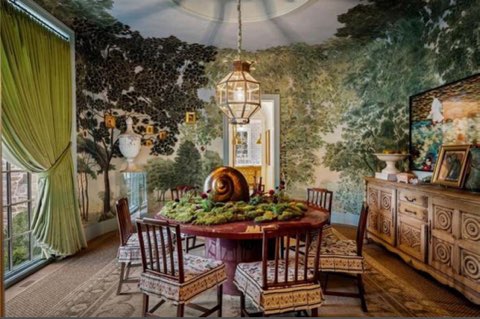
Passing back through the mudroom hall, beyond the garage entrance, glancing once more at the jewel box powder room by Pamela Williams Interiors, we finally arrive to the dining room to our right. This room specifically was what Victoria and crew drove 10 hours roundtrip in one day for. Yes the kitchen and scullery were incredible and unexpected but this room was the sole reason for our Alderwood Adventure. It called to us from afar, beckoning us from North Carolina to come and see what Atlanta had to offer. Tied (in our opinion) for the most stunning room in the house, the dining room exuded the principals of design (color theory, symmetry, asymmetry, scale, proportion, impact, balance, ratio, rhythm, texture, etc).
The best way to describe the domed dining room, designed by Melanie Turner Interiors, is like walking into a traditional English painting of an immersive forest. The canopy from the trees absorb the light sources in the room to create a comfortable, casual shade and yet the literal floor to ceiling window allowed enough light to make the room bright enough to entertain. The wallcovering was custom created specifically for this room. While the pattern does exists for the general public, it was re-scaled to fit this room specifically.

We LOVED the pattern play of this room. Obviously, if you're familiar with Alderwood Interiors, you know we are a sucker for most green and brass combinations, and this room definitely implemented our favorites. We could sing Melanie's praises all day long but for us the cherry on top of this incredible room would have to be the mix of textures. From the smooth aubergine lacquered table to the plush velvet drapery, this room effervesced with tactile details. Layered, classic, and yet still modern, Melanie Turner Interiors brought a bold yet refined impact to the showhouse.
The dining room connects back to the foyer to bring us full circle, but before we travel to the expansive second story, it is time to cross through the living room into the most expansive yet still intimate primary bedroom suite that we think ties with the dining room for the best room in the house! Consuming the entire lower level of the east wing of the home, the Primary Suite includes a stunning bedroom, top of the line bathroom, and his and hers luxury closets.

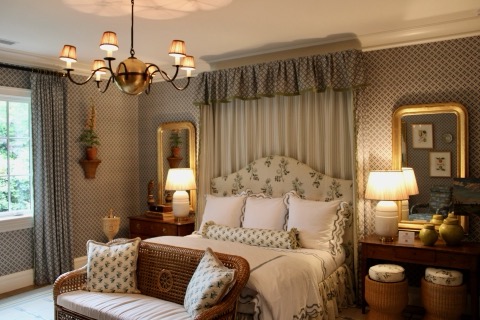
Beginning in the bedroom portion of the suite, which was designed by Jared Hughes Design, this primary bedroom is heavily inspired by the traditional design aesthetics of English country homes. Wallpaper, antiques, tapestries, mohair, velvets, and chinoiserie all combine to create a tranquil oasis of relaxation. Immediately upon entry you can see every angle of the room and the stately king size bed acts as the focal point to welcome you into a peaceful escape.
Our favorite part of this primary suite was a tie between the attention to detail and the pattern play throughout the room. The window drapery pattern frames the window wall and stately side windows of the room as well as the cornice above the bed. When contrasted against the geometric patterned wallpaper, and the striped patterned poufs, the traditional florals of the drapery really pop. A keen eye and a bold client is needed to brave extreme pattern mixing, and we are so happy Jared Hughes Design took the risk to show us all how fabulous pattern play can really be!

We also really loved the geometric and yet still floral pattern created by the plaster motifs on the ceiling. This accent really tied the whole room together. At first glance, the room seems to be a simple, serene, and livable paradise, but further observation quickly reveals the detail, time, and effort it took to combine each of these touches into the room without overwhelming the whole space.

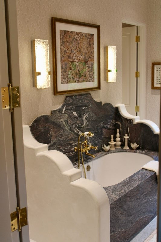
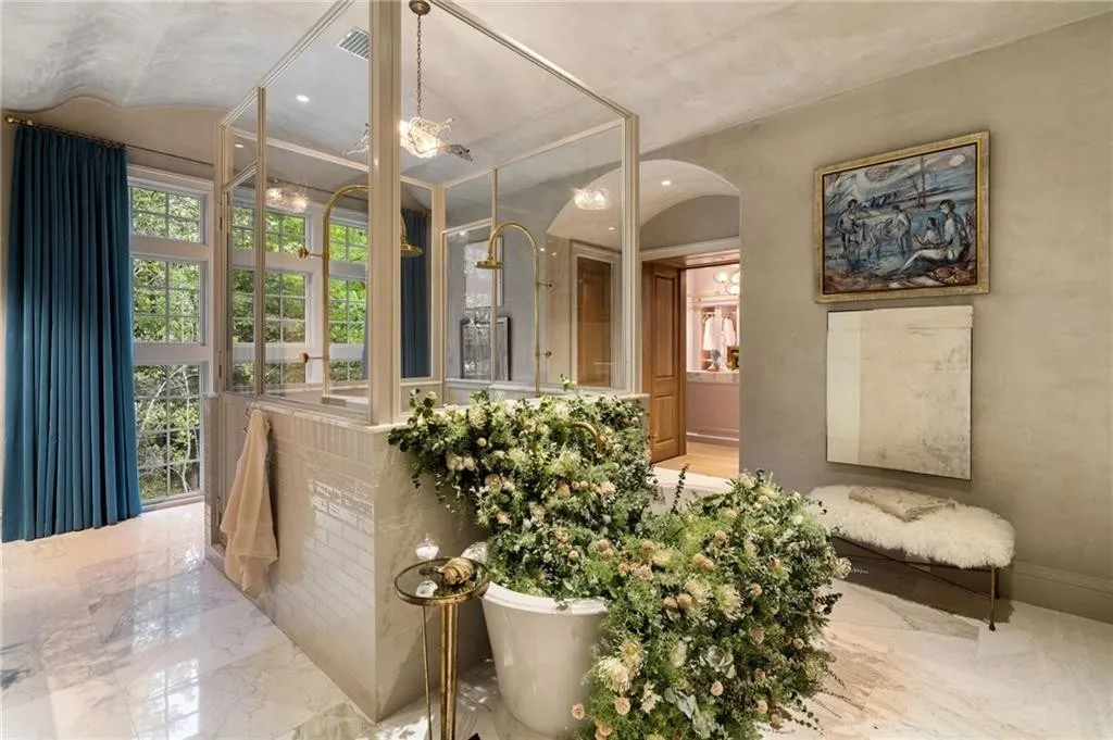
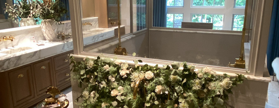
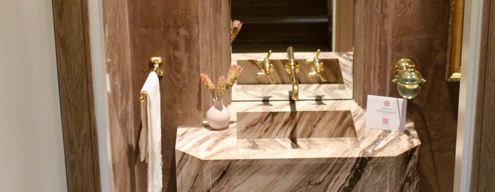
Passing by the suspended George II mirrors, and the gargantuan antique tapestry, we move into the primary bath. Designed by Source, we can truly say we have never experienced a bathroom similar to this one ever in our life! A scalloped and barrel vault Venetian plaster ceiling cascades into heavily textured Venetian plaster walls. Calcutta gold marble floors span the entire length of the bathroom and the stone repeats on the countertops. The cabinetry by Kingdom Woodworks frames an insanely large mirror which also contains an antique sconce protruding from it's center.
Shifting our focus from the architectural details of the room to the dual shower, stand alone tub, and vanity that all seemingly float in the middle of the room, we noticed the beautiful polished brass fixtures by Waterworks. We also could not help but notice the eye catching glass walls which were framed in brass and resting atop the ceramic tiles of the base of the shower, forming the upper portion of the shower frame.

Stepping into the encased shower space, the craftsmanship was obvious. The designers had inset the drain, meaning it was flush with the shower floor and had installed a notched out, hidden from view from the exterior, shower niche shelf that ran the length of the shower to hold necessities. Dual shower heads and dual controls ensured no compromise would need to be made between shower settings.
To the rear of the dual shower is a vanity set across from wall to wall, floor to ceiling windows. Heavy blue velvet drapes lightly kiss the marble floors and bring exciting color to the bath while allowing privacy when desired. Lastly there are two opposing enclosed private commode closets so there is never a need to cross the house should one be occupied. As we exit the primary bath, past the dual commode closets, and head into the dressing rooms, we are stopped by the most interesting oak flush panel doors. Meaning, that when they are closed they appear to be regular doors, but once opened, they seamlessly blend into the wall and appear as if they are part of the wainscoting or paneling on the wall. (Shown in the rear of the photo below, also check out that antique flying goose light pendant!)

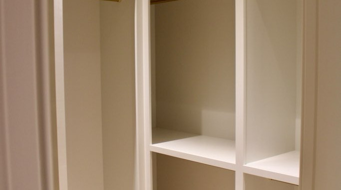
Entering through those oak doors and into the most feminine and exquisite "her" closet we have ever had the privilege of encountering, we immediately gushed over how great of a job Indigo Pruitt Design Studio did as a whole, and how cool it was she showcased her own fabric and wallpaper designs throughout the closets. Truth be told, we at Alderwood Interiors are admittedly not wild about the color pink. Not because we do not like the color, but actually because it is overused and rarely done well in spaces. This is not the place for our "pink tangent" though so we will skip that this time. We bring that up however to prove that when we say Indigo Pruitt Design Studio perfected this pink closet, that you know we meant it!

Perfectly seamless Kingdom Woodworks cabinetry, bold patterns, mixed textiles, brass detailing, a statement pendant light, library ladder, and ample storage space really set the mood as a quiet space for the lady of the home to be able to relax, get ready for the day, and enjoy some time for her self.
Our favorite aspect of this closet is actually another tie. We loved the use of pink throughout this space, and as we mentioned all the way back in the scullery, the optimization of the space by implementing both open and closed storage. Beautiful garments, accessories, and shoes could be readily displayed while off season or more utilitarian items could be properly stored away in conveniently located and easy to access areas.
While the space was large enough to entertain, it also was designed to be a private reprieve for the incredibly stylish woman who will one day call it home. We dream of the day we can gab with our girls in a similar space while preparing to jetset to our next girls get away....they say girls can dream right?!

Moving to the left, passing an oversized mirror and the in-closet washer and dryer, we now make our way into the final room of the first floor, the "his" closet, also designed by Indigo Pruitt Design Studio.
Obviously this dressing room belongs to the man who has no time to fuss about. Everything is neat and in order, easily accessible and any of his belongings could easily be put away. Efficient, succinct and ready to go to work, this closet is the direct contrast of the "her" closet. Like Yin and Yang the two create a whole, while simultaneously complimenting and contrasting one another.

Once again, closed storage and open storage perform a delicate dance of balance throughout this room, but the shining characteristic of this closet for us was the efficiency, almost proactive, intentionality behind the design. The dressing room feels as if at any moment your own personal butler will pop out from the cabinetry and begin bustling away at whatever you need. While that obviously is not the case, the closet really does anticipate the needs of the user, because it is designed intentionally to do so, which is exactly why we love it! Even the most incredible, indescribably beautiful space would lose it's beauty if it did not function efficiently. Fear not, that is not the case in this men's dressing room!
Whoo! You've made it through the first floor of this 10,000 square foot home, high five for you! Let's call this our intermission, after all we still have a second story full of incredible bedroom suites, and an insane basement to traverse together. Take a walk about your space, stretch those legs, grab a snack and then come back settle in and let's get started on the next half of the home!
For our visual learners here is a quick recap of what we've already gone over, minus the beautiful outdoor seating area (designed by Liz Williams and included in our full galery and discussed at the end of our article.)

The Second Floor:
Welcome back! Settled in and comfy? Got your water and a snackie? Great because we have some great spaces coming up!
In order to get to the second floor we will need to exit the men's dressing room, pass through the ladies dressing room, hang a left into the primary bath, continue into the primary bedroom, exit to the left into the mini hallway, bypass the stairs to the basement, (sounds creepy but we swear its the most incredible basement and totally not creepy at all, do not worry we will get there) turn right into the living room, cross in front of the incredulously large fireplace, and then turn left in order to take two steps up onto the landing of the second story staircase.

After all that walking, it would be really inconvenient to need to go to the bathroom as we are currently at the farthest point from any of the nine bathrooms in the house. Lucky for us and the future owners of the home, the design team thought of that!
Just outside of the living room and at the base of the stairs to the second floor, lies the most convenient and stunning formal powder bath. Designed by SOURCE, the ceiling and walls are entirely finished in mauve dyed Venetian plaster, giving the entire room a soft luminescent quality. The mirror above the sink is deeply inset to the plaster with a scalloped surround giving it a dramatic presence that makes it seem more like an art installation than a mirror.
The floating marble vanity with an integrated stone sink adds to the drama of the formal powder room, completely disguising the plumbing from view but not from access. Dripping in antique brass finishes, this formal powder bath is brimming with elegant character.
Our favorite part of this powder bath would have to be the inset storage space behind the artwork for excess toiletries. Once again we see that design really is all about making spaces equally beautiful, functional, cohesive, and efficient. So much thought goes into creating a space that functions for your family before the elements of beauty are ever introduced.

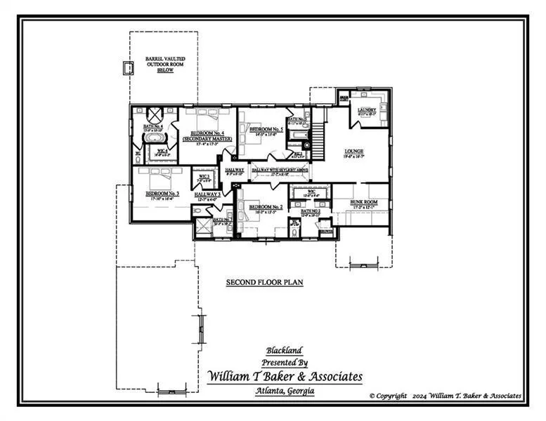
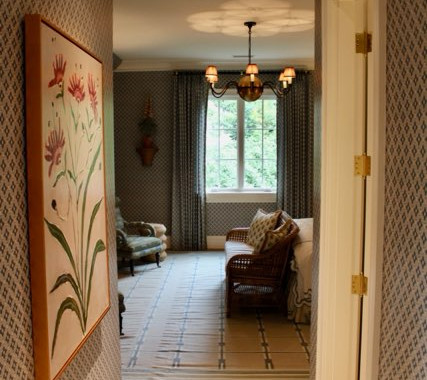
Leaving behind the powder bath and summiting the stairs, we meet the upstairs parlor. Inspired by the lounges of the 1930's which focused on conversation and board games, Habachy Designs created a gathering place for the occupants of the home to relax informally.
Incorporating pieces from India, a completely custom crafted for this space desk, murano glass, vintage pieces, custom felted wool textured art, tweed furniture, tessellated dolomite artwork, and grasscloth wall paper makes for moody and comfortable area for conversing with friends without having to leave the second floor.
Something you should know before we continue through the second floor to minimize confusion, is that most of the rooms on this floor stem from the main hallway. Every bedroom will have a corresponding bathroom and closet. On the second floor there is a laundry room, parlor, bunk room, Jack and Jill bath, guest room 1, guest and bathroom 2, guest suite and bathroom 3, guest suite and bathroom 4, and a connecting hallway, which happens to be the next stop on our tour.
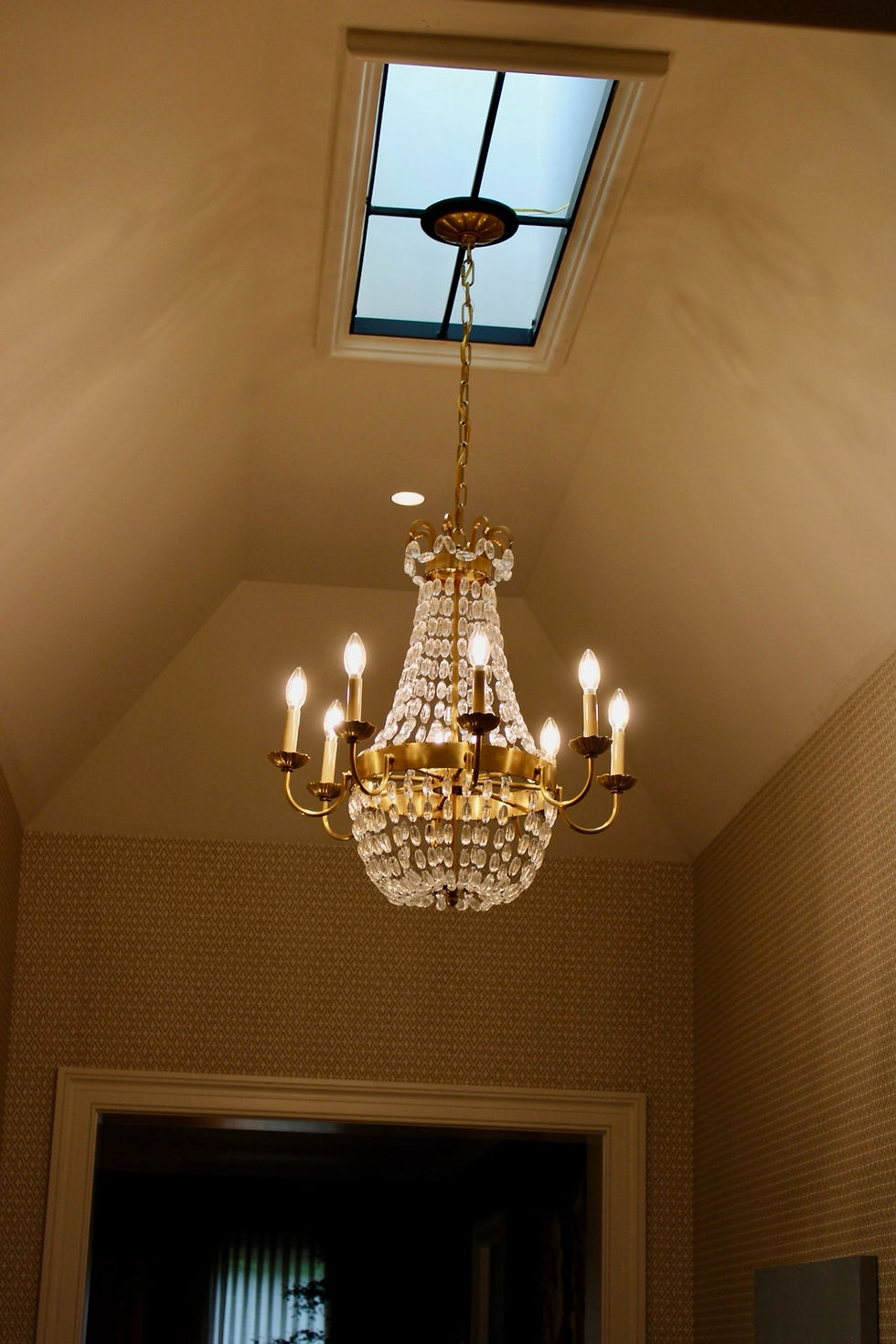
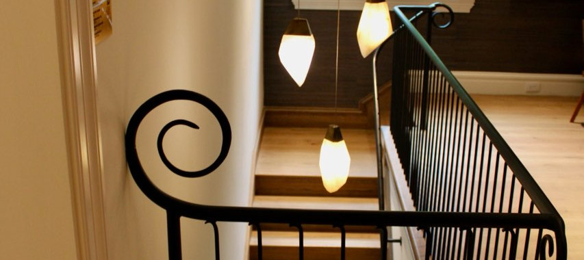
Leaving the parlor behind, passing the stairs and entering the hall, there is absolutely no avoiding the focal point as it is shining above the hallway suspended from a skylight! The vaulted ceiling also helps to direct your eye to the chandelier.
While the main purpose of a hallway is utilitarian and for getting from one room to the other, if designed correctly, a hallway can be much more. Which is exactly why Courtney, the owner of C. Walker Designs, wanted to "make the transitional [hallway] space feel intentional and beautiful, not just functional." Like Honey Collins did in the living room, Courtney created moments in which you can pause. A reading bench offers a place to sit for a while, and artwork invites you stop and stare. Completing the space through decor and a mixture of antiques combined with contemporary items, help to finalize the design of the space with intentionality.
The skylight in the interior hall was cool enough, but suspending a chandelier from that very same skylight to maximize the dispersion of light, while hiding all the connections and wiring was a stroke of genius from C. Walker Designs that we just could not get over!

In order to complete our tour of the second level, we are actually going to follow the hallway all the way to its end and work back towards the stairs. At the very end of the hallway and turning left we are brought into the third and very spacious guest room suite designed by Ellie Christopher Interior Design. As mentioned previously, this estate is massive, and as such, two of the guest rooms are really their own suite. Every bedroom in the house has an ensuite bath and closet but bedroom 3 and 4 are each the equivalent of a studio apartment by themselves.
Entering into guest room three, we walk into a hallway of sorts, that brings us past an insanely bold full bath on our left and walk-in closet on our right before the space opens up into the bedroom area.
The bedroom boasts custom real linen wallcoverings from Elliston House which is also used on the drapery and bed hangings. Vintage wicker furniture pieces bring warmth and texture to the space, and once again pattern mixing is incorporated in order to create visual rhythm and contrast. A large dual window encompasses much of the exterior wall allowing the landscaping to be admired from the interior and lending a significant amount of natural light into the bedroom.

Opposite the bed, bold artwork commands attention while being accented by fine antiques and custom porcelain foxgloves perched eternally atop brackets.
Scroll armchairs, originally found at auction then upholstered and refurbished, sit across from the wicker love seat. Creating this seating arrangement allows for a dedicated multi use space for a wide array of possibilities such as; ease of dressing, reading, packing for a trip, or a space to chat within the room. Also important to note, the multi use space increases the functionality of the room while allowing the guests that are inhabiting the room to have their own space devoid of the host of the home, which is imperative if you truly want your guests to feel as comfortable as possible during their stay.

Crossing the rear of the second story hall, we enter to the right into guest suite 4 designed by Alcott Interiors. As with guest suite 3, guest suite 4 really is a private oasis for any guest where they can retreat and enjoy quiet moments to themselves without inconveniencing or consumining every free moment their hosts may have. Allowing guests the space to be independent is often overlooked until after the guest is already in your home and you find yourself counting the days until they depart. Never a fun situation to be in and thankfully, not one the future owner of this home will ever need to experience again!
Alcott Interiors envisioned guest suite 4 as a daughter's suite in a stately English countryside manor house, the influence of which is blatantly, yet elegantly, apparent throughout every aspect of the design.
Carolyn Kendall, the founder of Alcott Interiors describes guest suite 4 as "A design that blends tradition and modernity with a clear nod to Cotswold style, where nature, heritage, and comfort come together in a harmonious way. Whether it is the delicate floral motifs, the integrate texture or the calming color pallette, each aspect feels like a tribute to the serene beauty of rural England." We could not agree more! The handprinted silhouettes set against the textured grasscloth backdrop of the wallpaper, classic four poster bed, dramatic lighting elements, custom geometric patterned rugs, lounge area, and antique gaming table combine to create our favorite guest suite of the home.
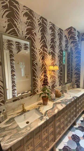
Moving across the room and into the ensuite bathroom we are stunned to see an incredibly opulent venetian plaster framed statement tub, rounded walless shower, dual vanities, private commode closet and a fashionable closet designed to hold all the bits and bobs a young lady may ever want.
Decorated with exquisite details such as; an organic lined wallpaper, vintage Italian brass mirrors, a vintage Parisian cartoon painting, bubble glass sconces, a velvet tape trimmed vanity ottoman, and bespoke towels. Each choice speaks to the immense attention to detail Alcott Interiors dedicated to this space.
Again, this was our favorite of the two guest bedroom suites! Everywhere we looked intention shined through the design. While antiques played a massive roll in this suite, the room itself never felt dated or ever gave the impression that the curated items within it's walls had ever belonged in any other space than bedroom suite 4.


Returning once more to the main second floor hallway, we travel to the standard bedrooms which still have their own closets and en suite bathrooms. Both bedroom 2 and 5 were designed more for the daily occupants of the home instead of guests as they do not offer seating areas fit for multiple people. Turning left into the most architecturally detailed room in the whole house, bedroom 2 is an absolute stunner designed with Spring in mind by The Jane Group.

Framed by scalloped drywall and covered in a beautiful floral motif wallpaper, the bed wall acts as a focal point for the entire room. Inspired by the prime view of the lovely dogwood trees in the front yard, The Jane Group brought nature indoors with the grasscloth mural, called Charleston Garden. The mural is covered in peonies, birds, butterflies, and botanical details. Bursting with color, this wallcovering set the color scheme for the entire room.
Antiques, bold captivating artwork, a feminine silk upholstered bed frame, lush layered bedding, and modern secretary combined to make this eternally classic, dream of a bedroom. The Jane Group leaned into their classic Oxford education to really nail the traditional English style that was the driving force behind the design style of the entire estate.


Joining bedroom 2 and the bunk room lies a Jack and Jill style bathroom, also designed by The Jane Group. Not to oversell this space by any means, but we could not imagine it designed any differently. It is as if Janie Wilburn intimately dissected this room and then designed it perfectly. We noticed that The Jane Group even went so far as to perfectly color match the green piping that trimmed the robe hanging on the wall with the stripes of the wallpaper. That level of dedication to the details proves not only is Janie classicaly trained, but that she deeply cares about design and attention to detail.
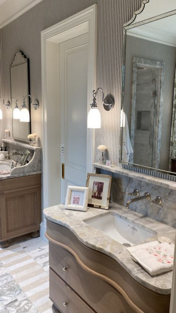
Striped olive green wallpaper melds with polished silver finishes, bold statement patterned marble floors, serpentine front vanities, and an enclosed shower that feels like its own room across from the private commode closet to form this shared bath.
Once again Victoria found her self reaching for her phone to text her husband about how she was envious of the antique vanity poised perfectly in front of the window framed with beautiful drapery. Victoria has been attempting to convince her husband to agree to the exact same concept in her own bath, and yet here is that concept completed and implemented by another designer in the showhouse. So she can say she was right about the idea and has now, at least, been vindicated by leting her husband know just that. She giggled as she snapped a photo specifically to send to him so she could tell him he needed to get on board with her plan!

Walking from bathroom 2, through bedroom 2, and directly across the hall, we arrive to bedroom and bathroom 5. Much simpler in design, Imani James Interiors actually wanted the focus not to be on the design itself but actually on the view from the window. Imagining that this bedroom was to belong to the future family's eldest daughter who was away at college, Imani James Interiors hoped that this room would be a "reflection of nature, art, and the spirit of coming home." We definitely feel like the room exudes a calm energy which is embodied in the soft watercolor pastels, wave patterned textiles, in the florals and the butterfly details throughout the space.

For us the most intimidating room to design is a child's room, as children's rooms bring a whole addtional layer of demands that need to be met. Updating your home in any capacity is a luxury that takes time and money, and once you've finished a room you typically are not going to want to fully redesign in a few months because your child no longer likes Bluey, now they like Paw Patrol. With children's rooms as a designer, you have to design for the child they currently are, the child they will become, the teenager they grow into, and the college student that comes home to crash at mom and dad's when they need to do their laundry. A child's room must also be resilient and formidible against rough and tumble shennanigans. The only thing that would make a child's room more challenging to design, is if the space also needed to function for adults as well. This is the exact predicament Alexandre Fleuren Interiors found themselves in when designing the last bedroom of the second story.

Thankfully, Alexandre Fleuren Interiors did not shy away from the opportunity and seized the moment. Taking inspiration from the Agatha Christie novels of her youth, she created a bold and colorful room for kids and adults of all ages to rest after family gatherings or birthday sleepovers. The joyful colors make children feel welcome, while classic textures and finishes make any grown ups feel comfortable and at ease as well.
Designed to hold three twin beds, the bunkroom comes in handy when extended family stays over night, when the girls night turns into a girls sleepover, or when the guys flew in to finally get the round of golf out of the group chat.
We loved that this space welcomes all ages and has an immense number of uses! Coming from a larger family, it would be such an asset to have a spare three beds during family functions so the fun does not have to stop just because the day has ended. Including space for guests ensures that you can entertain the masses without throwing your own home into upheaval.
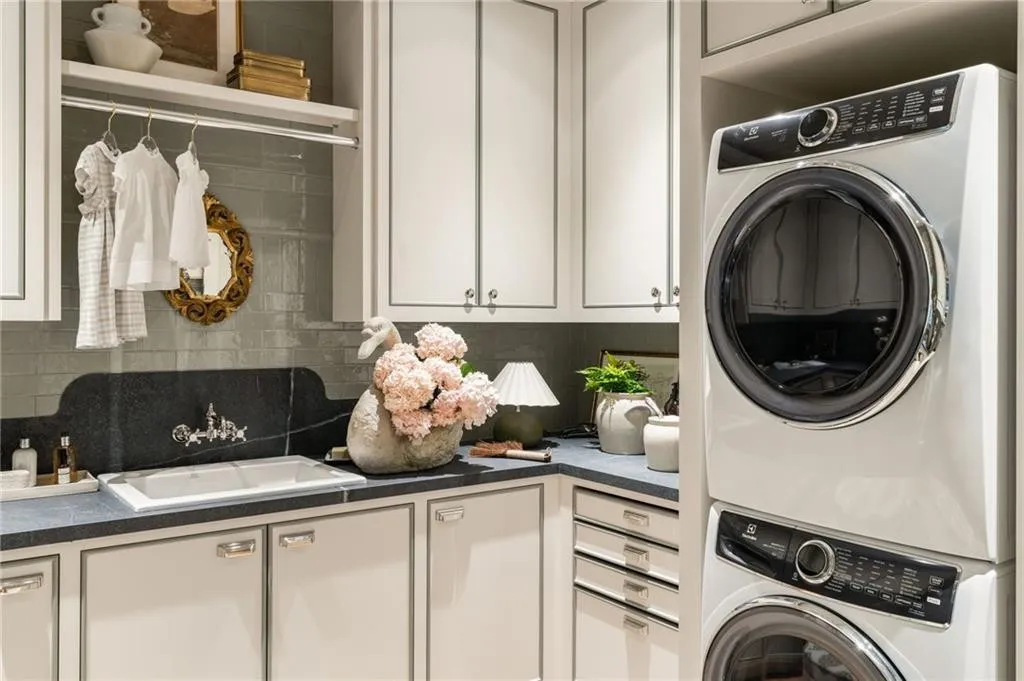
Seven beds and three couches in five bedrooms, all of which are on one floor, means lots of blankets, pillows, duvets, sheet sets, and an absolute mess of dirty clothes. This is where the final room of the second story of the 2025 showhouse comes in handy. Exiting the bunk room, passing back through the parlor, and turning right before we reach the stairs, we find ourselves standing in a laundry room designed by the infamous Ashley Miller Design.


Ashley Miller Interiors did an amazing job in this space. Truth be told, we feel like this is one of the most well thought out and thoroughly designed spaces in the entire estate.
The details and intentionality in this space is absolutely undeniable, our pictures do not even begin to do justice for just how refreshed and at home this space made us feel!
Sage green floor to ceiling tile sets the tone for the room, cocooning you in a warm calming feel that is both fresh and timeless. The same soft green color continues to the piping on the cabinets, textiles, draped roman shades, and the velvet trim of the upholstered fabric stools. The wallpaper ceiling not only brought in subtle structure to the room but also gave the room a finished feel. We were so excited to see that Ashley Miller Interiors took the risk and designed such a bold ceiling , as it sets her apart from the other designers in the house (the ceiling is the fifth wall of the room, it needs attention too!) We loved the little touches; antique pottery and botanical artwork suspended on chains from the picture rail, which elevates and gives depth to the space.

By creating a layered, warm, and incredibly elevated yet also comfortably lived in space, the laundry room made you feel as if the owner of the home had just finished a fresh load of laundry and left the space. That made us feel we were welcome and as if we belonged in the space too. In this laundry room we did not feel like we were taking a tour of someone else's future house, it felt like we were home ourselves.
Lastly, we loved how Ashley Miller Interiors mixed and matched the hardware in the laundry room. The house carries brass hardware throughout, all the light switches, door handles, most of the lighting fixtures, and a significant amount of the plumbing fixtures were all polished or unlacquered brass. Don't get us wrong, brass is our favorite, however we love when designers mix finishes and get it right, it just adds a pop of unexpected fun to the room! If you look at each of the photos we have included of the laundry room you will see both brass and nickel in every photo. Together the two finishes balance the space in a warm and cool contrast that we adore.

Everyone who came into the laundry room had the same comment, "if my laundry room looked like this, I wouldn't mind doing laundry!" This is exactly what we have been trying to drive home through this entire dissertation of the showhouse. Design affects the subconscious, and creates an environment that calls to the very fiber of our beings.
At Alderwood Interiors, we know humans are hard wired by our Creator to seek out beauty. We want to be surrounded by it, immersed in it, because our souls yearn for it. We see a beautiful space and are immediately drawn to it. Making that space specificaly for the user by anticipating their needs with human friendly design is what turns a random room in a random house into a home specifically crafted for you and your family. Making a sanctuary where you feel most at ease and as if you are not wholly yourself when you leave, is what we strive to attain in every project. Everyone deserves to be fully at ease in their home, and design is the tool to use to achieve that feeling!

Anyway, we will save you from our passionate TED talk on the importance of design for another day, back to the tour. We have completed the first and second floor of the home, all living and utilitarian spaces have been dicussed in detail, so now it is time to see the spaces designed for fun! Above is the layout of story two, again for our visual learners. Join us below in our final act as we discuss the entertaining spaces!
The entertaining spaces:
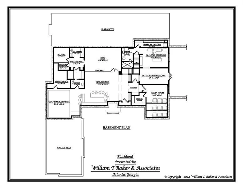
Remember a few paragraphs back how we said the basement stairs were not creepy at all and that they led to the most incredible basement ever? Great, because that is where we are headed right now! To get to the basement, we will need to leave the laundry room, pass through the second story parlor, descend the stairs, pass by the formal powder room, cross again through the living room in front of the fire place and take the same hall we would enter to go to the primary suite. However, instead of turning to the left to go to the primary bedroom we are going to hang a right and head down stairs to the basement.
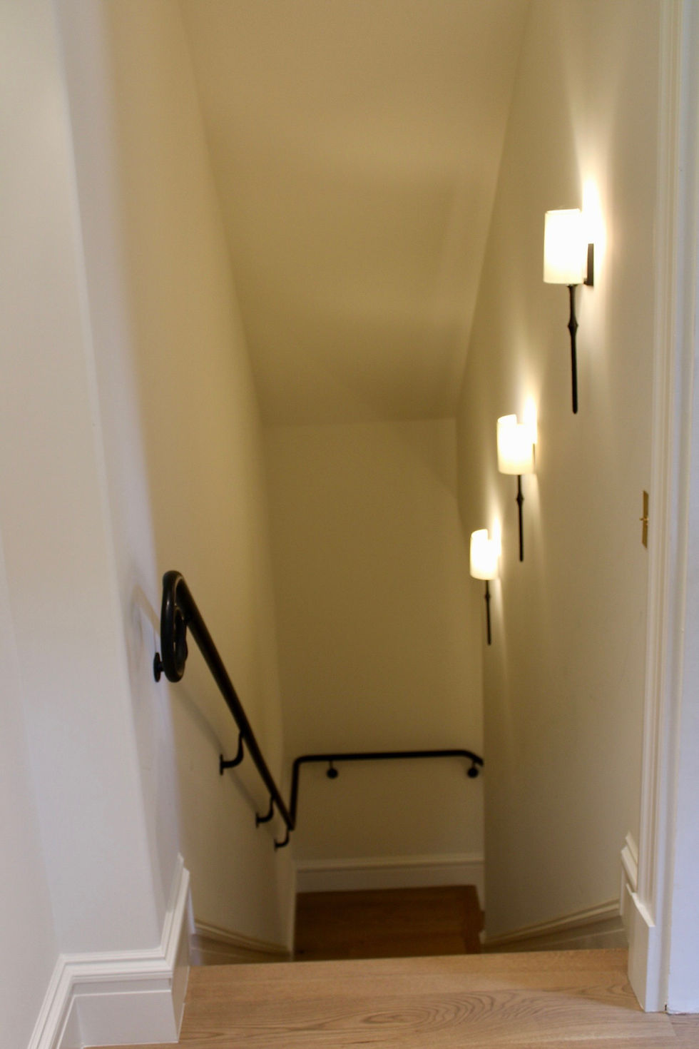
Truth be told we are not sure exactly what the railings are made of through the house but they were solid, thick, and textured. They felt like cast iron so that is the assumption we are going to make. We felt very secured holding on to them as we decended the stairs.
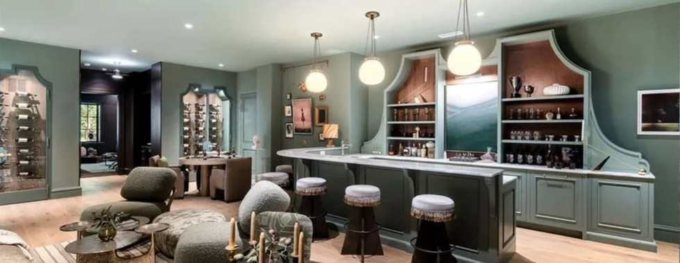
At the bottom of the stairs we turn right, and get the first glance into the exquisite lower level bar room designed by The Iron Gate. While we at Alderwood Interiors do not consume alcohol, a bar can be used for a wide array of functions, many of which do not have to have alcohol involved.
This olive green, color drenched, lounge is a massive gathering space in a mostly square long narrow pass-through room with no natural division, making it a challenge to design. Once again we see the same trick implemented in a different room, where The Iron Gate used furniture to divide the space into segmented zones.

As you enter into the lounge, the first zone consists of the twin custom built-in wine cabinets which flank both sides of the hallway leading to the media room. Zone two contains a four person table that sits in front of the best gallery rail wall installation in the entire house and offers an informal seating area to rest with friends. Moving to the left, we next come to zone three, which is the largest zone in the lounge. Fully functioning, with luxury amenities, custom statement cabinetry that mimics the detailing on the wine cabinets, and the ability to seat twenty-four people, the bar and adjoining seating area are large enough to be an open-for-business speakeasy.

We loved that The Iron Gate saturated this room floor to ceiling in a moody olive green, that they used an incredible tapestry-like curtain as a wall to divide the lounge from the wellness center, and that they mixed patterns and texture everywhere you looked. Cushy upholstered seating, warm, low lighting, and cozy zones combine to make a lounge oozing with cool, jazz-like vibes that would make entertaining entirely too fun! Oh, and we should probably mention the bar also housed an additional area in the rear left corner, specially built to house a golf simulator!
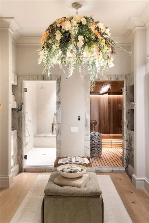
Heading back towards the stairs, but turning left before we get to them, we enter the beginning of the terrace level gym and spa wing designed by SOURCE, and referred to as the wellness room.

Featuring a rubberized floor home workout area that is ready to be filled with your favorite workout machinery, a beautiful spa quality seating area, water bottle filling station, huge twin wet and dry saunas, separate cold plunge tub room, and half bath, there really is no need to leave this home for anything other than social gatherings.
Including selections inspired by old-world European estates, the wellness rooms boast bold artwork, sculptural statues, natural stone mosaics, tumbled stone, and warm woods.
We know if we were the future owners of this home, we would have groceries and shopping delivered, we would work remotely as much as possible and only ever leave for appointments and or social gatherings that were not held at our home. There is no doubt in our minds that we would become complete shut-ins, and who could blame us!

Daydream aside, the spa and wellness area is an incredible space dedicated to living the best and healthiest life possible. A standout feature of this space was the floral light installation. Described by SOURCE as "a soft organic contrast to the sleek stone and nickel elements, it is a small reminder that wellness isn't just about function, it is also about beauty too."
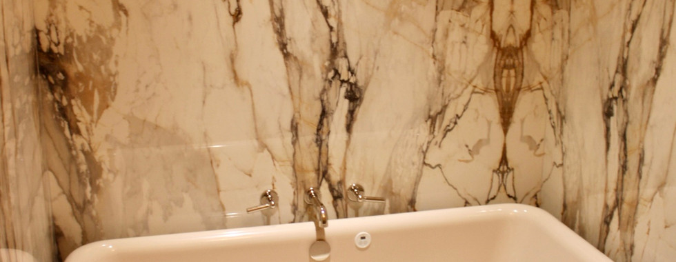
The cold plunge room seemed to becarved out of marble. We were completely surrounded wall to wall by beautiful warm toned marble. The only other objects in the room were the very large, murano glass statement light, and very deep cold plunge tub which sat across the room from a built in bench that seamlessly integrated and blended into the marbled wall (pictured in our gallery).

Passing through the joint sauna room, continuing into the cold plunge room, we arrive at the dual entrance half bath that brings us full circle back around to the lounge. Designed by The Iron Gate, this barreled powder room is simple but stunning. We were mesmerized by the gilded, ovular mirror that was suspended mid air over a rear arched floating vanity and flanked on both sides by stunning oversized nickel sconces.
We love when designers incorporate equal, face level lighting beside of a mirror as it helps cast the most complimentary light on the person standing in front of the mirror. By keeping the light equally spaced and in line with the face, no shadows are cast, and the person in the mirror is reflected in their best light!
Leaving the lounge and wellness area behind we head to the final two indoor spaces of the home. Betwixt the twin wine cabinets is a small hall that contains our last two rooms and a minibar. To the left lies what the showhouse called the mother-in-law suite, designed by Kit Castaldo Design.
This in-law suite was designed with the well traveled in-laws in mind. In contrast to the rest of the home this room was inspired by the Italian countryside. Entering into the vestibule, the wall is covered in a hand painted mural of trees in a park.
A single chair and small mirror welcome you as you enter in to the vestibule and create a moment reminiscent of a painting.

Moving on, there is a reading nook that invokes a relaxing feel via its use of linen, velvet, and wool textures. Two elongated chaise are perfectly poised in front of french exterior doors and heavily draped in beautiful, dense drapery. A desk offers the ability to play a game, complete a puzzle or even get a bit of work done.
Personal touches and timeworn chairs combined with contemporary furnishings, help to make this in-law suite feel more like a retreat in a very fancy hotel rather than a bedroom in a basement.
The bedroom is spacious and continues to be on theme with the modern contemporary furnishing, artwork, and lighting but old world Italian style accents.
We absolutely loved the pendant light for this room, it was so cool! Standing underneath the pendant, no light came directly down through the pendant to the bedroom, it was reflected against the inside of the pendant light, and refracted off of the ceiling to cast ambient and warm light over the whole room. We also adored the antique dresser, the details of the wood were incredible. As with all suites there was an attached bathroom (pictured in the gallery) and walk-in closet for this room as well.

As a side note, with as many rooms as this estate has to offer we think this space would be better utilized as a mutil-use spare bed room. The design was beautiful, but the designated use of the space seems odd to us.
We could see this space coming in handy in instances where friends or family members may have been a bit too enthusiastic at the lounge to drive home safely, or maybe as a bedroom for your teenage to college age son who thinks he is too cool to hangout and be in neighboring rooms with his younger siblings. Maybe even as a private room for your daughter and her new husband to come visit and stay awhile. Regardless of the instance in which to use the spare bedroom, there are not many mother-in-laws we know who would enjoy being schlepped into the basement when such fine accommodations are available upstairs.

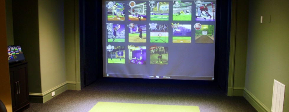
Anyhoo, our opinion aside, as we exit the in-laws suite we see the mini bar designated for quick access for any and all the goodies you may need while watching a movie, sports event, or gaming with friends in the media room.
Even though the media room is only about 40 feet from the lounge, luxury is best described as pretty, well made, and convenient. When you have the space for a minibar, and you're paying $15 million for a home why not have one??
Eggplant purple commands a dramatic setting for both the mini bar and the media room. Paired with deep chocolate brown coffered ceilings, we can only imagine how fun it would be to watch a movie in this space!

With opulence in abundance, plush oversized loveseats, a HUGE movie theater quality screen, tasteful glamorous decor, gilded finished furniture and an integrated sound system, we just know this media room is way more fun than actually going out to the movies!
We really enjoyed this space and were honestly dissapointed a movie was not on when we came to tour the house, because we would have hid away and hibernated in this media room. It was almost like you sunk into the room, becoming a part of the space as soon as you entered. Which actually did happpen to us! Because the carpet was so dense and thick and sat atop the soundproofing, it felt like a cloud! Our shoes sunk into the carpet like a kid playing in a plush grass backyard!
In all honesty, Victoria was wearing heels and was the first to enter the media room, unaware that the carpet would absorb half her shoe, she almost rolled an ankle and fell over! It was such a funny moment, thank goodness she caught herself! We cackled together in the media room while Victoria tried to balance around the room and take photos for this blog without falling over. This was one of many fond memories we made while visiting the 2025 designer showhouse.


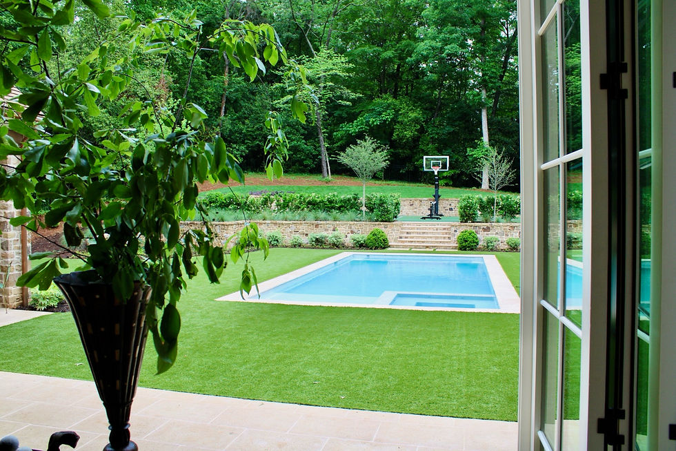
At last, you've done it! We now have reached the very final space of the showhouse! The outdoor back patio located on the first floor of the showhouse, just outside of the kitchen, designed by Liz Williams Interiors.
Bursting with performance fabrics and furnishings, this outdoor living space was designed with both luxury and durability in mind so that the space can be enjoyed without worry. The polypropylene rug is a lovely woven sisal that can actually be hosed off!
The barrel vaulted ceiling, stunning stone work, and elegant arches immediately grab your attention, but the inviting and comfortable furnishings ensure you sit and stay a while. We can just imagine the afternoons and evening spent out here during the spring and summer, swimming in the pool, playing pickle ball or tennis on the elevated back court, summer holiday parties, you name it! This outdoor seating area, and stunning back yard will absolutely be where the fun is at all summer long.

"Victoria, good Lord, we get it! Alderwood Interiors took a really cool trip, saw a fancy showhouse, and wrote a ridiculously long article about it but why does it matter to me?" That may be what you are thinking right now, so please allow us to explain!
We totally understand that an approximately $15 million dollar home (listed on the MLS at $9.25 million, which is the the price only for the empty house, if the buyer does not purchase the items in the home it will come with no furnishings, statement lights, wallpaper, art, plants, rugs, etc) is not an attainable home for 90% of the people you may know, but that does not mean that a beautiful house that is designed especially for the benefit of your family is out of reach for you!
By incorporating the prinicpals of design into your home, mixing high and low end items, and including a tastefully selected antique here and there, we can help you elevate the look of any home. Thankfully here at Alderwood Interiors, that's kind of our bread and butter when it comes to design! If you're looking to make a change in your space (big or small) and enjoy not only the visual aspect of a well designed room but also the effect a designed-for-you-space can have on your mental health, and life overall, we would love to work with you!
Click the button below, and fill out our inquiry form to start the conversation and process today!
We shared at least one photo of the main spaces of the home in this article but, we highly encourage you to check out our full gallery from our trip below, that moves through the home as one would if they were there with us and see the photos that were not included above! We loved the master bedroom, guest suite 3, bedroom and bathroom 2, the scullery, formal powder room, back hall powder room, the incredible basement bar, and the joint wellness area! Who are we kidding, we loved all of it and are still gushing over our trip! For us to see our passion of luxury design in action, in person, with little to no boundaries, was such a gift that we are lucky to have experienced!
Thank you, truly, for reading along and sharing our experience, we are grateful beyond measure for you!
If for some reason we did not cover enough you can also still visit the 2025 showhouse webpage while it is still active.
2025 Atlanta Homes & Gardens Designer Showhouse Homepage
Finally, should you be looking to purchase the 2025 designer showcase home, or if you are wanting to see the rooms photographed in their entirety, please see the below link for the listing.
Listing:
GALLERY


Wow! What an incredible home and opportunity to see luxury designers work first hand and in person. Thank you for taking the time to type all of this out so we could experience it as well! I love these pictures and agree that dining room is spectacular!!!!!! You know a lot about design and this article has really opened my eyes that a well designed space is efficient as well as beautiful. There's a lot that goes into a well designed space!